Asgaber: A Modern Serif Typeface for Digital Elegance
As a UI designer who ships landing pages, SaaS dashboards, and boutique e-commerce experiences, I treat typography like structural code—it’s not decorative; it’s functional, intentional, and deeply tied to how users perceive trust, clarity, and value. That’s why Asgaber stands out in my font library: it’s a carefully crafted serif typeface that bridges modern minimalism with timeless elegance—without sacrificing digital legibility or expressive range.
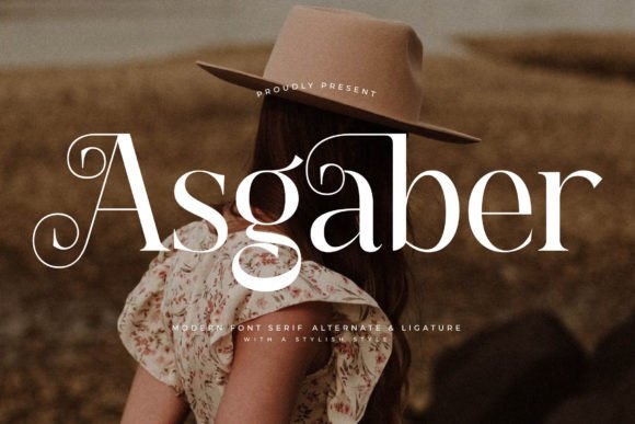
Visually, Asgaber balances clean geometry with subtle calligraphic warmth. Its high contrast, refined serifs, and open apertures give it presence at large sizes—ideal for hero headlines, logo lockups, or section titles—while its even stroke modulation ensures readability down to 24px on desktop and 20px on mobile. Unlike many display serifs that collapse at smaller sizes, Asgaber maintains rhythm and distinction across weights, making it unusually versatile for web use.
In practice, I reach for Asgaber when the brand voice demands sophistication without stiffness—think a sustainable fashion label launching a new collection, a premium coaching program positioning itself as authoritative yet approachable, or a literary podcast rebranding its website and social assets. Its personality is quietly confident: classic enough for editorial credibility, modern enough for digital-first audiences.
For hero sections and landing page headers, Asgaber excels at establishing immediate tone. Pair it with a neutral sans serif like Inter or Manrope for body text, and you create clear visual hierarchy: Asgaber sets the emotional anchor, while the sans handles information density. On dark backgrounds—especially deep charcoal or navy—I use its Regular or Medium weight with generous letter-spacing (0.5–1.2px) to avoid visual crowding. Over image overlays, I apply subtle text shadows or semi-opaque background bars to preserve contrast without dulling its character.
It’s especially effective in conversion-focused layouts where perceived quality directly impacts action. On product pages, I use Asgaber for the headline (“The Edit Collection”) and subheading (“Timeless craftsmanship, ethically sourced”), then switch to a highly legible sans for specs, pricing, and CTAs. This contrast signals importance without overwhelming—users scan the Asgaber lines first, then read supporting details. For buttons, I reserve Asgaber for primary CTAs only when space allows and context supports it (e.g., “Discover the Story” on a brand narrative page), but default to a clean sans for secondary actions to maintain scannability.
Online stores benefit from Asgaber’s ability to elevate product naming and category banners. In a boutique skincare site, “Lumière Serum” set in Asgaber Medium feels luxurious and precise—more so than a script or ultra-thin serif would allow. Its balanced x-height and consistent spacing prevent awkward line breaks in responsive grid layouts, even on narrow mobile viewports. Just avoid using it below 18px for body copy or in dense lists; it’s a display serif, not a text face.
For portfolio sites and creative agencies, Asgaber strengthens brand cohesion across touchpoints. Use it consistently for project titles, client names, and navigation labels—then pair with a monospace or geometric sans for captions and technical notes. That duality communicates both artistry and precision. In course sales pages, I’ve seen it lift perceived value: “Master Typography for Digital Products” gains authority when set in Asgaber Bold, while bullet points and instructor bios stay in a readable sans.
Font pairing matters—and Asgaber thrives alongside restrained companions. Avoid competing serifs or overly ornate scripts. Instead, pair it with a humanist sans (like Lato or Nunito) for warmth, or a neutral variable font (like IBM Plex Sans) for flexibility. For editorial-style blogs or newsletters, Asgaber works beautifully for article titles and pull quotes, while body text stays in a highly legible, well-hinted sans with generous line height (1.6–1.8) and max-width constraints.
Technically, Asgaber delivers what modern web projects need: WOFF2 support, full Latin character sets, standard OpenType features (ligatures, small caps, stylistic alternates), and multiple weights—Light through Bold—with matching italics. It includes basic multilingual support for Western European languages, making it suitable for bilingual landing pages or EU-facing SaaS tools. Always verify webfont licensing before embedding: most commercial licenses cover self-hosted usage on live domains, client sites, and digital templates—but check whether app embedding, email clients, or resale in design kits are permitted.
One practical note: test Asgaber across devices before finalizing. On iOS Safari, enable font-display: swap in your @font-face declaration to avoid invisible text during load. In Figma or Adobe XD, use it for mockups—but remember to specify fallbacks (e.g., “Asgaber, Georgia, serif”) in your CSS so typography degrades gracefully if the font fails to load.
Finally, consider context over consistency. Asgaber isn’t meant for every headline on every page. It’s strongest when used deliberately: for moments that define brand voice, guide attention, or signal intentionality. In a world of generic system fonts and overused Google Fonts, choosing Asgaber says something about your standards—not just as a designer, but as a steward of user experience and brand integrity.
- Best for: Hero titles, logo text, section headers, branded banners, premium product names
- Avoid for: Long-form body copy, data tables, micro-interaction labels, low-contrast overlays
- Pair with: Neutral sans serifs (Inter, Manrope, IBM Plex Sans), not other serifs or scripts
- Licensing tip: Confirm web embedding rights—and whether license covers client projects or resale in digital templates
- Responsive note: Use font-size-adjust or clamp() for fluid scaling on headings across viewport widths